THE ASK
People in the Bay Area are really busy and planning trips can take up a lot of time, and some people don’t want to deal with the hassle of catching a flight.
There are lots of tour/experiences sites out there but it would be nice to have one that’s focused on this region just for weekend trips. A lot of people in the Bay are super busy and would love to see more of the region. The aim is to take the stress out of planning trips and cut the amount of time it takes to plan one.
THE APP
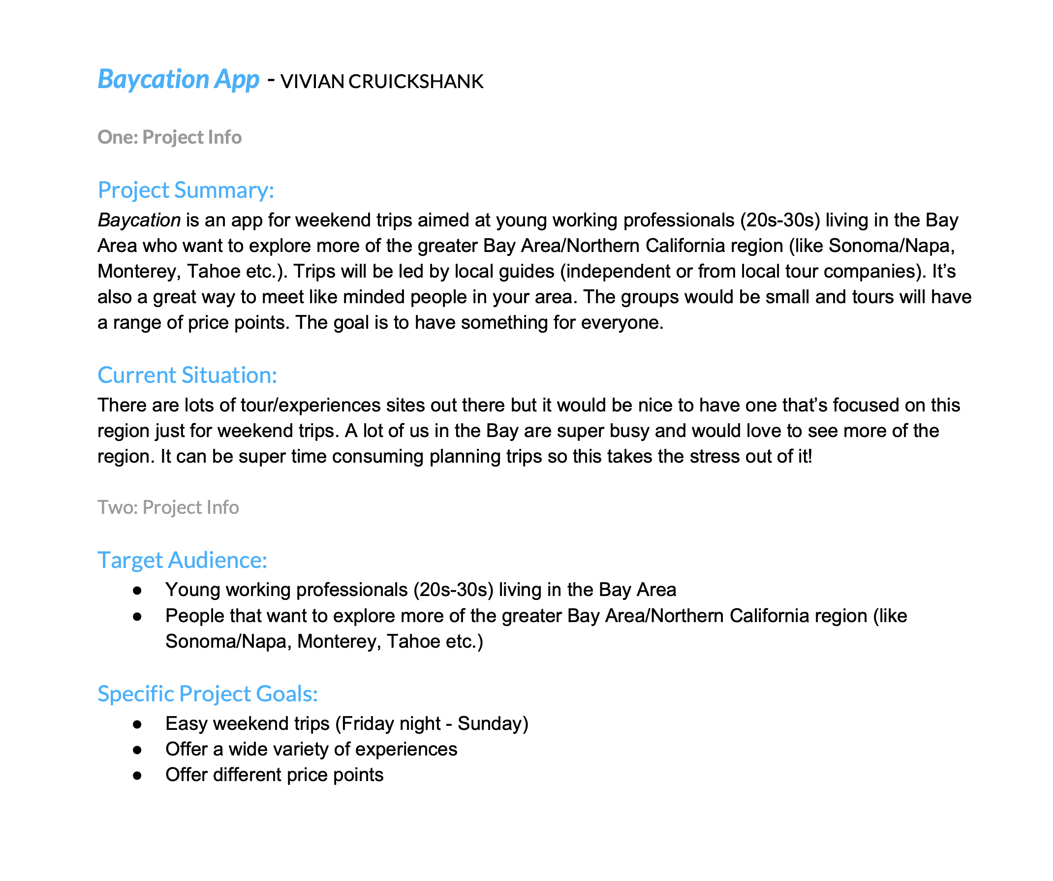
Baycation is an app for weekend trips aimed at young working professionals (20s-30s) living in the Bay Area who want to explore more of the greater Bay Area/Northern California region (like Sonoma/Napa, Monterey, Tahoe etc.). Trips will be led by local guides (independent or from local tour companies). It’s also a great way to meet like minded people in your area. The groups would be small and tours will have a range of price points. The goal is to have something for everyone. Users have the option to go on a day trip or a two day trip.
THE FOCUS
I didn’t have time to develop an entire app in ten weeks, so I focused on two activities, selecting a trip/activity and then booking it.
STRATEGY
Started by interviewing stakeholders, used guerrilla style interviews, and then found a common activity and tested it.
DESIGN BRIEF
WHAT I DID
To get things rolling, I created a design brief which outlined the scope of the project.
WHAT I LEARNED
By working with the client, I was able to figure out who the target audience was and the design goals for this product.
TOOLS USED
Google Docs
USER PERSONA
WHAT I DID
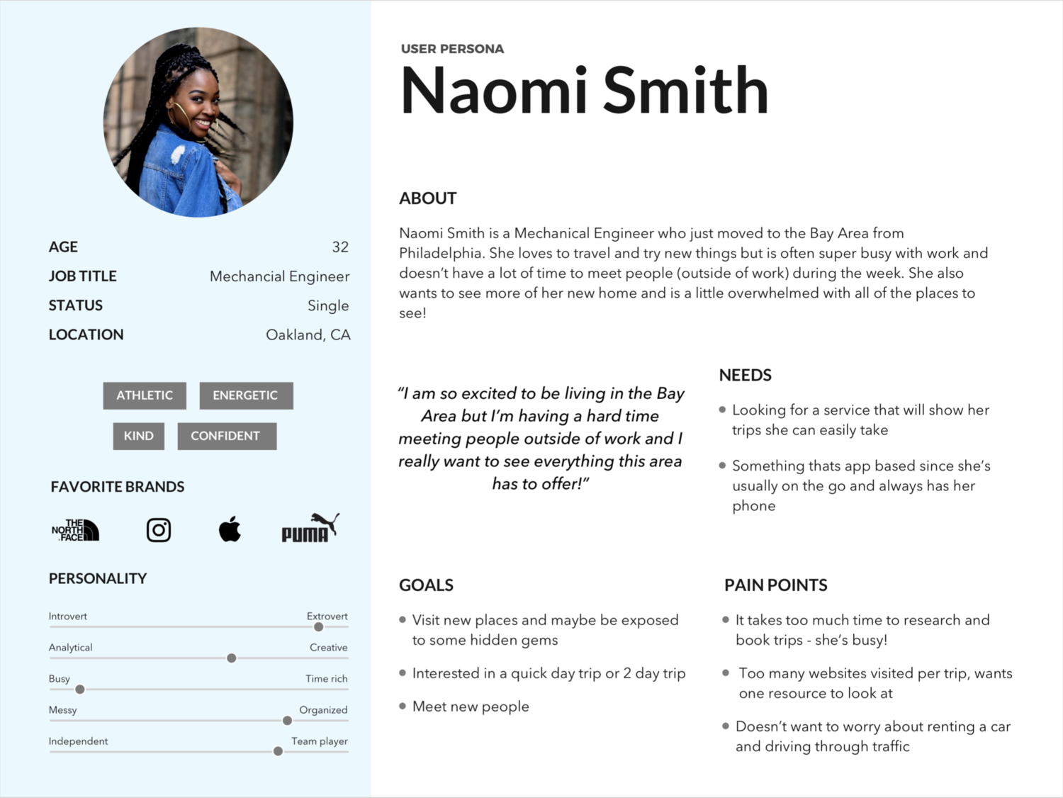
I started with a porto-persona to create someone who would represent the target customer for Baycation.
WHAT I LEARNED
By researching online, listening to travel podcasts, reading travel blogs and talking to individuals who work in the local travel industry, I found that the consumer base for these types of trips is pretty representative of the general demographics in the Bay Area, with the average age being somewhere between 25-45. I also found out that there is no one economic demographic of an average traveler in the Bay Area. After synthesizing the user research, I was able to define a key persona, Naomi, who is looking to receive curated weekend trips based on her specific preferences.
TOOLS USED
Pencil and paper
Sketch
CUSTOMER JOURNEY
WHAT I DID
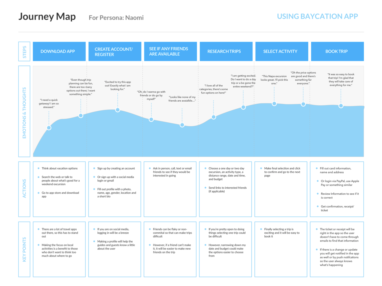
I created a journey map to visually represent an individual’s relationship with the product over time and across different channels.
WHAT I LEARNED
In order to find the key feature opportunities, I mapped out what the user’s vacation planning looks like, including what the pain points are at each phase.
TOOLS USED
Sketch
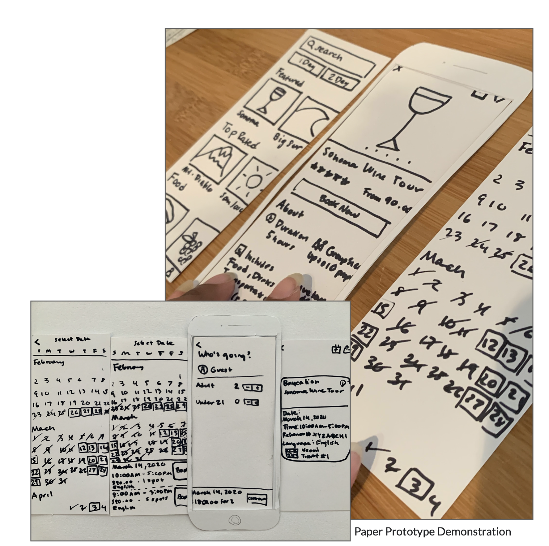
PAPER PROTOTYPE
WHAT I DID
Starting with the information gathered from my research phase, I had enough information to start sketching out the design of the app. In order to see how users would interact with the wireframe elements, I recruited 10 participants to partake in paper prototyping. I found that the most prominent road block users encountered was confusion around picking a trip.
WHAT I LEARNED
Doing this was a great way to get feedback very quickly and I feel like it put less pressure on the user and get really honest feedback since it’s a sketch. In the original wireframes, users could only see a couple of trips per category which resulted in a lot of scrolling. So for the next round, I knew that I would need to show more options on the screen with each category.
TOOLS USED
Pen and paper
Marvel app - https://marvelapp.com/5ijga10/screen/66562353
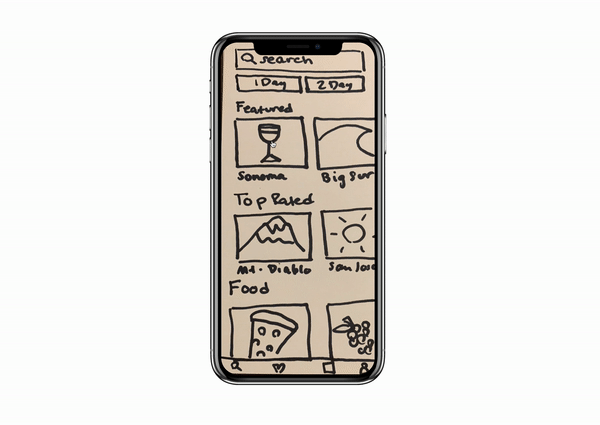
Here is an early idea of how the user would interact with the product.
Feel free to test it for yourself here.
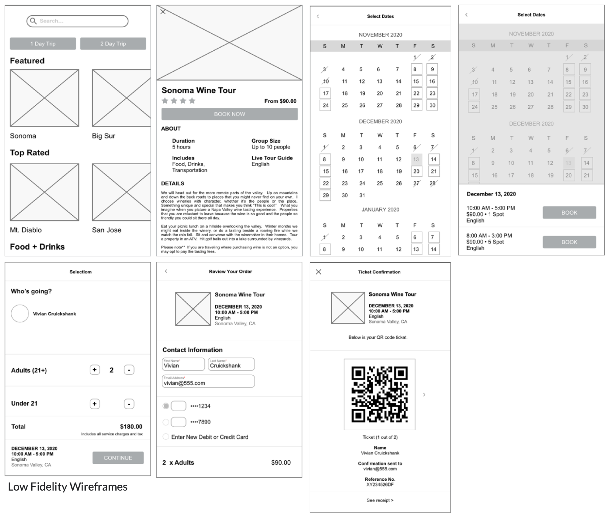
WHAT I DID
Working on the paper prototype gave me the foundation to start working on digital wireframes, which demonstrated the elements on each screen.
WHAT I LEARNED
Like the paper prototype, it is easy to make changes and get really honest feedback from users.
TOOLS USED
Adobe Illustrator
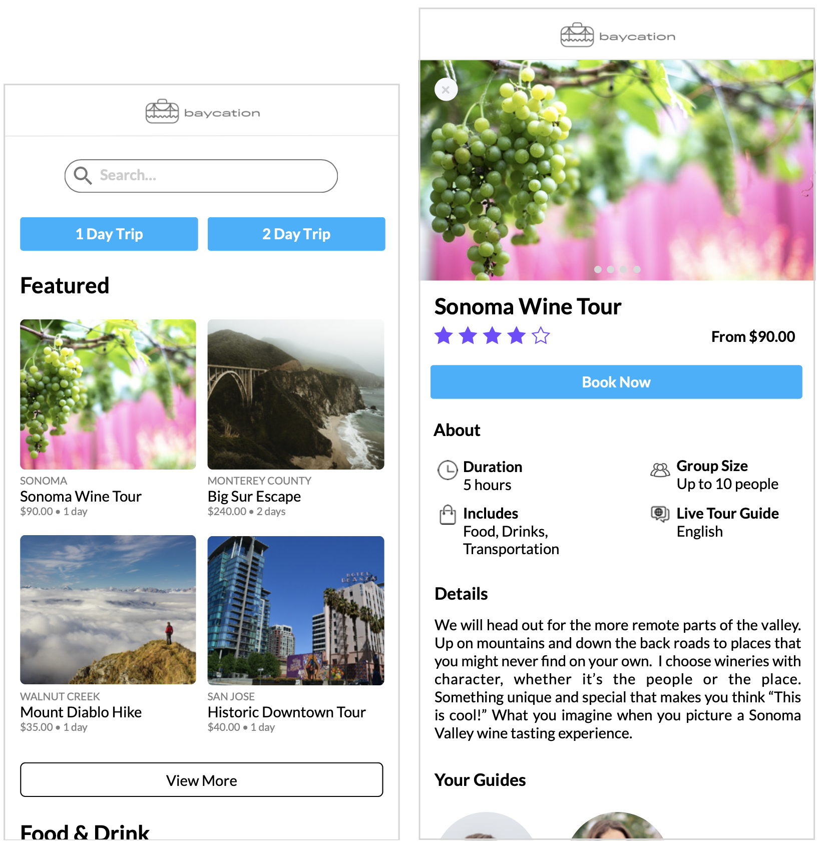
WHAT I DID
Once I got feedback on my low fidelity wireframes it was time to evolve it into a more finished product.
WHAT I LEARNED
By having a prototype that looked more finished, I was able to get a better sense of how users would interact with the product in real life. Also it was beneficial to test out specific UI components.
TOOLS USED
Adobe Illustrator
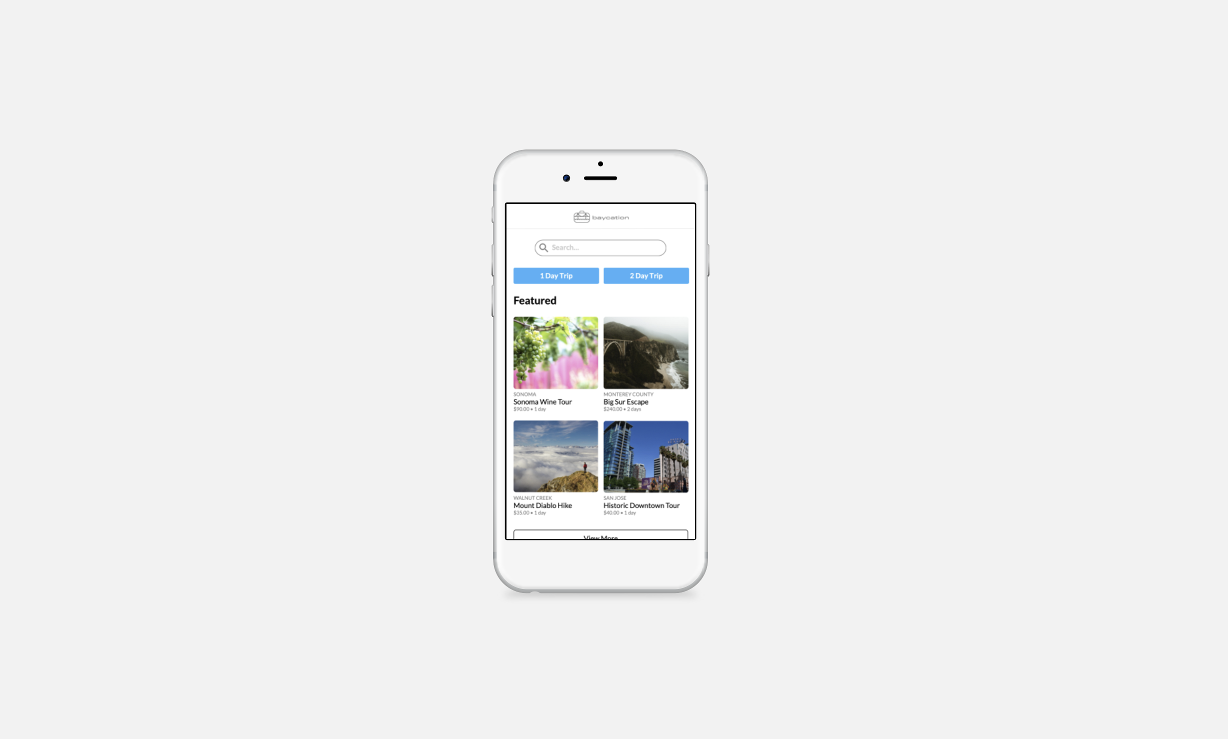
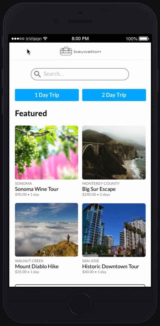
Here is the finished product created in InVision.
Feel free to play with it here.