San FRANCISCO PUBLIC LIBRARY - INFORMATION ARCHITECTURE REDESIGN

OVERVIEW
THE ASK
We had to choose a pre-selected website to focus on for the remainder of this course. I worked with one other person and we analyzed and redesigned the San Francisco Public Library’s IA. I designed the wireframes.
OVERVIEW
The current library website could be more user friendly, so our aim was to improve usability and task completion with the typical user in mind.
THE FOCUS
Since this was a class project, we only had six weeks to complete the IA redesign. We conducted tests/studies to determine site usability and follow the principles of information architecture (clarity, learnability, efficiency, accessibility, and robustness). Due to these time constraints, rather than conduct more research to improve task success rates we took the results from our research, updated our Abstract IA, and built a site map that represented our research findings.
STRATEGY
Our design process began with discovery research. During our process of creating tasks associated with visiting a library website, we created two (2) personas to help us put a face to the typical library visitor. After our research and personas concluded, we created a site map, navigation system, and wireframe for the website information architecture update.
The design process was designated by our course material. In a real-word design scenario, we would have included a paper prototype and usability test after the wireframe. Our suggestion to run additional tree tests and card sort studies was limited by time due to course timelines. If we choose to continue with this redesign for publication, we will start over in our tree test process. We also would like to move past wireframing and develop a mid/high fidelity prototype.
RESULTS & NEXT STEPS
Inconclusive - further studies and usability tests with iterations needed to complete the information architecture redesign.
View our presentation deck here. View our detailed case study here.
REDESIGN PROCESS
DISCOVER NEEDS
Strengths:
Library resource services are important to the community
Respondents happy with offerings within the library
Technology and free computer / internet access highly important
Opportunities:
Improvements: Safety big concern
Increase event/exhibit visibility throughout the community
Continuous technology updates to meet the needs of all visitors
Improve customer understanding of librarian’s full capabilities
BUSINESS GOALS AND OBJECTIVES
We must meet the needs of each user and bring them back to our library.
Objective 1 - Improve Digital Experiences
Objective 2 - Enhance In-Person Experiences
Objective 3 - Develop User-Centered Content
EXAMPLE PERSONA

REDESIGN PROCESS
EVALUATE & ANALYZE
TREE TEST #1 & GAP ANALYSIS
COMMON TASKS:
Ask a librarian a question
Log In to library account
Reserve a study room
Attend a meeting/event
Business services
Check out a book
Search for resources on a specific topic (business, taxes, small business owners)
Look for an eBook
Look for an event
Locate books and videos in Children’s section
Successes:
TEST ANALYSIS
Respondents experienced direct & indirect success on tasks that were basic library functions like find a book or ebook
No participants skipped a task
Only 2 participants abandoned the test but came back and finished it
Overall participants took less than 30 seconds to answer each task question
Challenges:
TEST ANALYSIS
Tasks that involved items that were outside of books and videos were more difficult to locate
Some labels were not clear and participants looked in different spots to complete the task
Structure organization/grouping could be more clear
Task #5: Small Business Start up

Direct/Indirect Fail: Respondents first click failed 47% of the time with a 60% fail rate overall indicating that we must rethink the labels in this task.
Task #6: BOOK SEARCH

Success: Respondents experienced a 47% direct success rate in this task (note that this task is a “typical library task” for the vast majority of visitors).
PAIN POINTS
Task #1 (Ask a Librarian): (40%) went to “Support Services,” (40%) went to “Research and Learn”, and other people tried a few different categories. It is not clear where this would be.
Task #3 (Reserve Study Room): 60% went to the right spot, (27%) went to “Events & Exhibits.”
Task #5 (Small Business Start Up): Majority of people went to “Research and Learn” first (47%) and (33%) went to “Support Services.”
Task #7 (eLearning): Majority went to “Research and Learn (67%), then (20%) books and media and then (13%) go to fast access digital resources. This isn’t clear.
Task #10 (Children’s Movie streaming): There is a kids page (74% went there) but it is not obvious - a few respondents went to “Books & Media”. This is misleading.
TASK 5: MISSED OPPORTUNITY

Task 9: Missed Opportunities
Task 5: Looking for business start up information
Large majority of community members rely on their public library for their free resources and services. The SF Library missed an opportunity to serve the new business owners by burying the resources that are available to them.

Task 9: Looking for a meeting
While many respondents found the correct path, there are far too many respondents who took paths unsuccessfully. 50% of respondents took the incorrect path at the beginning of this task. This label needs rethinking.
GAP ANALYSIS

Research: Gap Analysis Spreadsheet

Card Sorting & Tree Test #2
PARTICIPANTS

Standardized Ranking
Category grouping widely dispersed amongst the eight participants. During our standardization, we were able to narrow down to six categories for our site map.

Information Architect Abstract (1st Round)
After standardizing the results, we used the ranking to determine which tasks were placed under each group. Light green boxes indicate low ranking tasks that will need to be retested in the near future.

Label Ranking Sheet
Labels generated from Card Sorting Study

Question #4: Key Findings

Task: Look for an exhibit
Score dropped from 5 to 1
Time it took was 40 secs longer
Directness fell from 93% to 14%
Success rate dropped by 24%
Maybe an exhibit isn’t really seen as a “service”
Question #7: Key Findings

Task: eLearning
Average completion of task time slightly increased in 2nd test
Success rate significantly decreased in 2nd test
Significant decrease (to zero) in direct success of task completion in 2nd test
First click on first try was 14% success rate
43% of participants looked in “Books & Media” first
REDESIGN PROCESS
EVALUATE
KEY OBSERVATIONS

Lessons Learned
Mental models that guide decision making provided many different outcomes between participants, where our assumption was that cards would be sorted similarly.
Time it takes to sort cards were vastly different between participants
More often than not, researchers will need to run another study for clarification to refine ambiguous results
Information Architect Abstract (2nd Round)

SFPL SITE MAP

REDESIGN PROCESS
REFINE, VALIDATE & DESIGN
NAVIGATION OPTIONS
GLOBAL NAVIGATION
Pros:
Visible and accessible on each page
It allows direct access to key areas and functions
Cons:
If it is not tailored to the user, they may get lost
Library content is difficult to fit into 6 category labels; local navigation is needed to support global navigation
LOCAL NAVIGATION
Pros:
Presentation is consistent on all pages
Helps users specify what they are looking for - able to pinpoint preferences
Cons:
If they are not connected to the global system it makes usability for difficult
THOUGHTS ON ORGANIZATION OF CONTENT:
Top Navigation & Labels
Use common category labels visitors of the library will recognize - see Barnes & Noble for example
Follow WCAG - create content that is accessible to all library users
Website Organization
Use bottom-up approach to categorization
Apply navigation filters on left
Use terms recognizable to users
Consider an “Ask the Librarian” category as an online help option
Lessons Learned
Narrowing down open card sort categories harder than we thought
In-person card sorting provides more insight into categorization and mind map of participant
Some card sorting outcomes are left for interpretation
During analysis researchers took some liberties - unsure if this is typical practice
Open card sorting may result in having to follow up with a closed card sorting study to help narrow down categories
Card tasks may have been too general - e.g. “career resources” grouped in “Resources”
The template helped to guide our decision making
REDESIGN PROCESS
DESIGN
San Francisco Public Library: Current Homepage

Global Navigation
Large image promo for library “to go”
Navigation - similar to global navigation
Categories (current affairs, gardening, poetry)
Categorized search
Labels that match global navigation
Support & Services
Research & Learn
Upcoming Events
San Francisco Public Library: Current Books Page

Design: Wireframes Overview

Design Concept: The current SFPL website isn’t the most user friendly. After doing some card sorting exercises and tree testing with participants we created a new navigation for the website and some wireframes to go along with that. The current design is a bit outdated and is in desperate need of a cleaner, modern look. These are some proposed designs that would make for a better user experience.
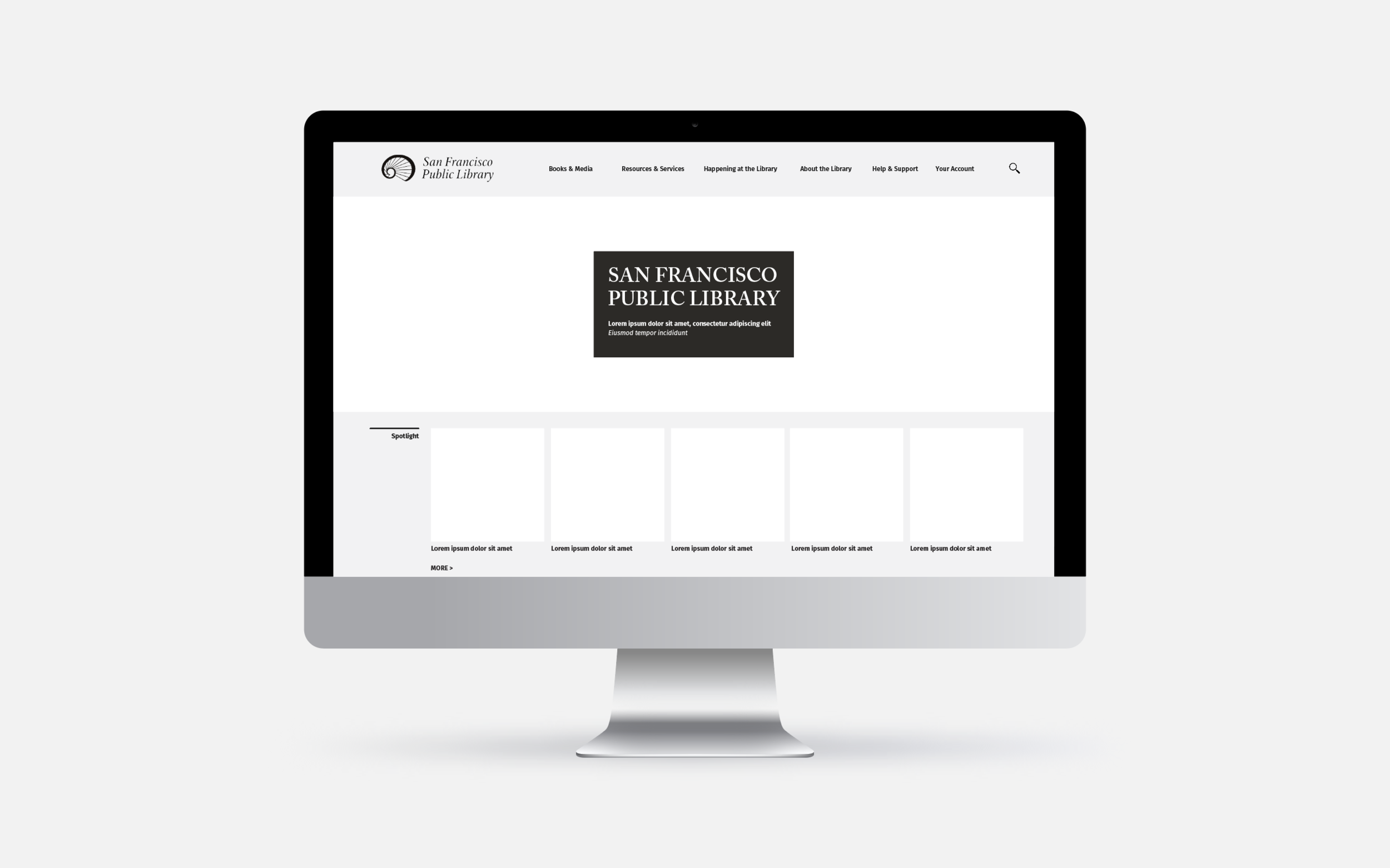
San Francisco Public Library: Homepage

Improvements:
Smaller header image
Small list of locations in the footer with a map
Easy access to support the library
San Francisco Public Library: Homepage - Drop Down Global Nav

Drop Down Global Navigation: When the user hovers over a section, it will be highlighted with an underline. Then once the user clicks on it, the navigation will drop down. To get out of it, users can click on the section title or anywhere else on the page. On the current SFPL website, users cannot click off to the side to get rid of the drop down.
San Francisco Public Library: Homepage - Scroll Down Global Nav

Navigation Option: When the user scrolls down the site, they would lose the navigation at the top but it would become accessible via a hamburger menu on the top left corner of the page. The rest of the page would become a little darker so the focus is on this. Then the user can click on this and the navigation will slide out. To get to the second level and beyond the user can click on an option and more would slide out. To get out of this the user can click on the “x” or click off of the navigation. The alternative is having the top navigation stay as a sticky header.
San Francisco Public Library: Books Page

Improvements:
Common tasks listed on the left
Easy search bar
See new releases by date (up to 5 months)
San Francisco Public Library: Books Page - Cont.

Improvements:
Clean list of selected books
Easy access to book club information
KEY Insights & Next Steps
Low number of participants in our original studies is not sufficient enough. We must recruit a larger population pool for further studies.
Rerun a tree test and card sort study that will help us gather valuable insights into the labels that best resonate with library users’ mental models
Tasks should be written without the label names in them to assure a more accurate result
Make an “Ask a librarian” button on the homepage so it is accessible to all web visitors and to host monthly lunch or evening talks on anything that people can find in the library. Research indicates that most library visitors are unsure of the vast amount of knowledge a librarian has.
Introduce new features and navigation options with a callout. The current SFPL website visitors may find a new layout difficult so adding some motion UX to help these visitors feel comfortable with the new language is very important moving forward.
Adding global navigation and local navigation adds usability features
Run usability studies on a prototype with a participant pool of more than 20 people