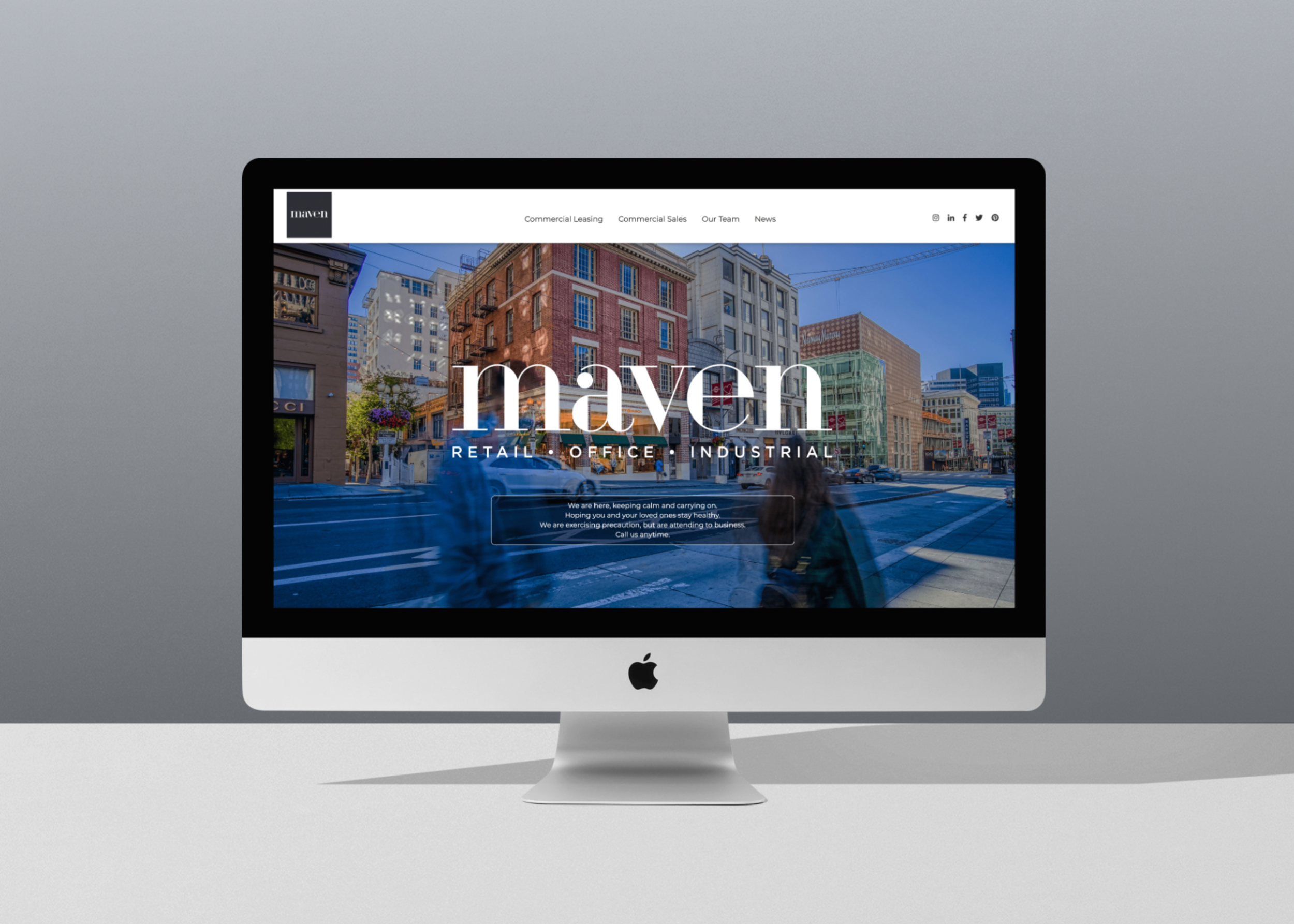
Maven Website Redesign

The Plan
OVERVIEW
DeRose & Appelbaum (a commercial real estate company in San Francisco) transitioned into Maven Commercial, Inc. and I was in charge of most of the rebranding efforts — including the website. The main goal was to make it easier to find available properties for lease and for sale. The logo was designed by an outside team, but I worked with colleagues to decide on some of the branding guidelines and I created all of the wireframes, and prototypes. The website itself was brought to life by our web developer.
GOAL
The DeRose & Appelbaum website didn’t have strong navigation and searching for properties (for sale and for lease) needed to be improved.
USER BASE
Potential and existing tenants (which include small business owners to large national and international companies), landlords and brokers (inside and outside of the company).
Visit the website (note: there have been updates from a new designer since I left) >

Learning from the Competition
Considering the time constraints for this project, I focused more on competitive research over user research. I checked out a lot, and I mean a lot, of real estate company websites and wanted to see how they presented their properties, how they used maps, what kind of photography they were using, and their search functions among other things. Even though DeRose & Appelbaum (D&A) was a commercial real estate firm, I also looked at some residential firms as well.
Comparing some of these sites content to D&A, I saw that some had really specific search functions which D&A was lacking at the time. That, along with the navigation structure and the readability of content were high priorities based on feedback from the team.
After several rounds of going back and forth with the team we decided what the structure for the website should be and it was very important that we had dropdown navigation.


The navigation is now consistent throughout the site and the text is more readable.


The old footer had a lot of bright orange, which stylistically felt a little dated and made the text harder to read. The new design is more sleek and visitors can also get to a simplified version of the navigation in the footer in addition to the header.

Property Page
One of the main pain points amongst the team was how it was impossible to find a specific type of listing without having to click through all of the links, which was a huge waste of time and contributed to a large amount of drop offs from the site. The amount of content was overwhelming, especially if a visitor didn’t know what they were looking for.
I decided to use the property page as an example because it was consistently one of the most visited pages on the website. The redesign gives visitors the option to search by use, address, neighborhood, and square footage. Additionally, I added neighborhood and square footage information to the property link, which gives visitors the option to scroll and get some more detail about the property.
This made the page much easier to use. In the old structure, visitors were only able to filter properties by what was new and by the square footage. With the square footage option there was no way to see if you were going from largest to smallest or vice versa, so clicking on a few properties was the only way to see that. Also, these options were hidden in a hamburger menu, which is typically reserved for navigation.
Making all of the search functions visible and displaying neighborhood and square footage on each individual property gave the page a less scattered feel.


Findings and Main Takeaways
FINDINGS
Once we launched the website, the results were pretty clear. By focusing on the navigation structure, improving on content structure and the property search feature, the website’s user engagement instantly increased, which is always good news because that has led to more properties going off the market (and more $$$). Maven has grown exponentially since the redesign and the site has been getting more hits over time. I have received a lot of positive feedback and am happy that Maven has a more user-friendly site.
TAKEAWAYS
This was my first website redesign. Being the sole designer, the amount of feedback I received could be very overwhelming at times. Often, my brain was spinning and going in multiple directions. My days were dominated by endless questions and theory crafting.
Sometimes, it was easy to be too focused on how the UI would affect certain elements on the page, and I would I briefly lose sight of things. Generally, I like to please everyone when it comes to my work and wanted to include every feature my co-workers pitched to me but that sometimes ended up being a problem. I learned that I needed to cherry pick and prioritize features better.